How the colour pink has disrupted the branding space

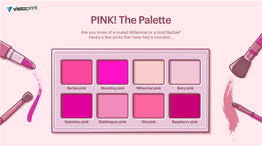
Currently, the first thing we think of when it comes to the colour pink is the Barbie craze which has helped spark a hot pink renaissance and turned #Barbiecore into a viral trend.
Barbie-esque style and design have existed in some form since the first Barbie doll debuted in 1959, but it returned to the zeitgeist in a big way in 2022 — thanks to the fashion world’s post-pandemic love of bright, mood-boosting hues, as well as public anticipation surrounding director Greta Gerwig’s live-action Barbie film.
Vista has revealed that over 600,000 logos created through their design services globally in the past year alone have embraced the use of the colour pink. Data also shows that the proportion of small businesses creating pink logos and using the colour in their branding has increased by 46% (June 2022 vs May 2023).
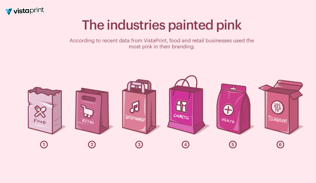
The hype and trend around pink has also been most prevalent amongst brands that are in sectors such as cosmetics, retail, food, medical and health sectors. Despite the colour pink being at its peak right now, it still remains relatively outside the mainstream of most branding and logos - Vista shared that only 3% of professionally designed websites use the colour pink currently.
In pop culture, pink usually conveys self-expression, romance, empowerment, and femininity. However, it is traditionally used by designers and advertisers to give brands a modern, youthful, fun, luxurious or traditionally feminine look.
Local Aussie small business Ashlee Studio shared that the colour pink inspired her to ‘brand’ her company - a small creative business which specialises in personalised illustrations, textured art, and event invites. Ashlee Capomolla said that when she started creating her logo, she chose a lighter pink as it represented the elegance and femininity of her artwork.
Ashlee mentioned that the colour pink was her favourite, way before Barbiecore became a trend. Therefore, when she was designing her logo and branding, her choice of the colour pink depicted a female business owner. Having shades of pink in the branding allowed Ashlee to also establish a welcoming, calming, and relaxing approach when building relationships with her customers too.
“Pink branding can often be perceived as limiting your business to a particular gender or sexuality, that was until Barbiecore, which has re-defined the use of pink. Barbiecore has enabled small business owners to not be afraid of using pink in their branding anymore,” says Ashlee.
The Barbiecore trend has been great in changing the views of what pink represents, as it now oozes confidence and boldness, and it is great to see many businesses embracing this.
As a VistaPrint customer, Ashlee has leveraged her branding across an array of marketing materials such as thankyou cards, business cards and stickers, and whether you love the energy and boldness of hot pink or not, you can’t deny its electric allure. After a tough few years, who could blame anyone wanting to escape to Barbie’s bedazzled, bright-pink dream world?

